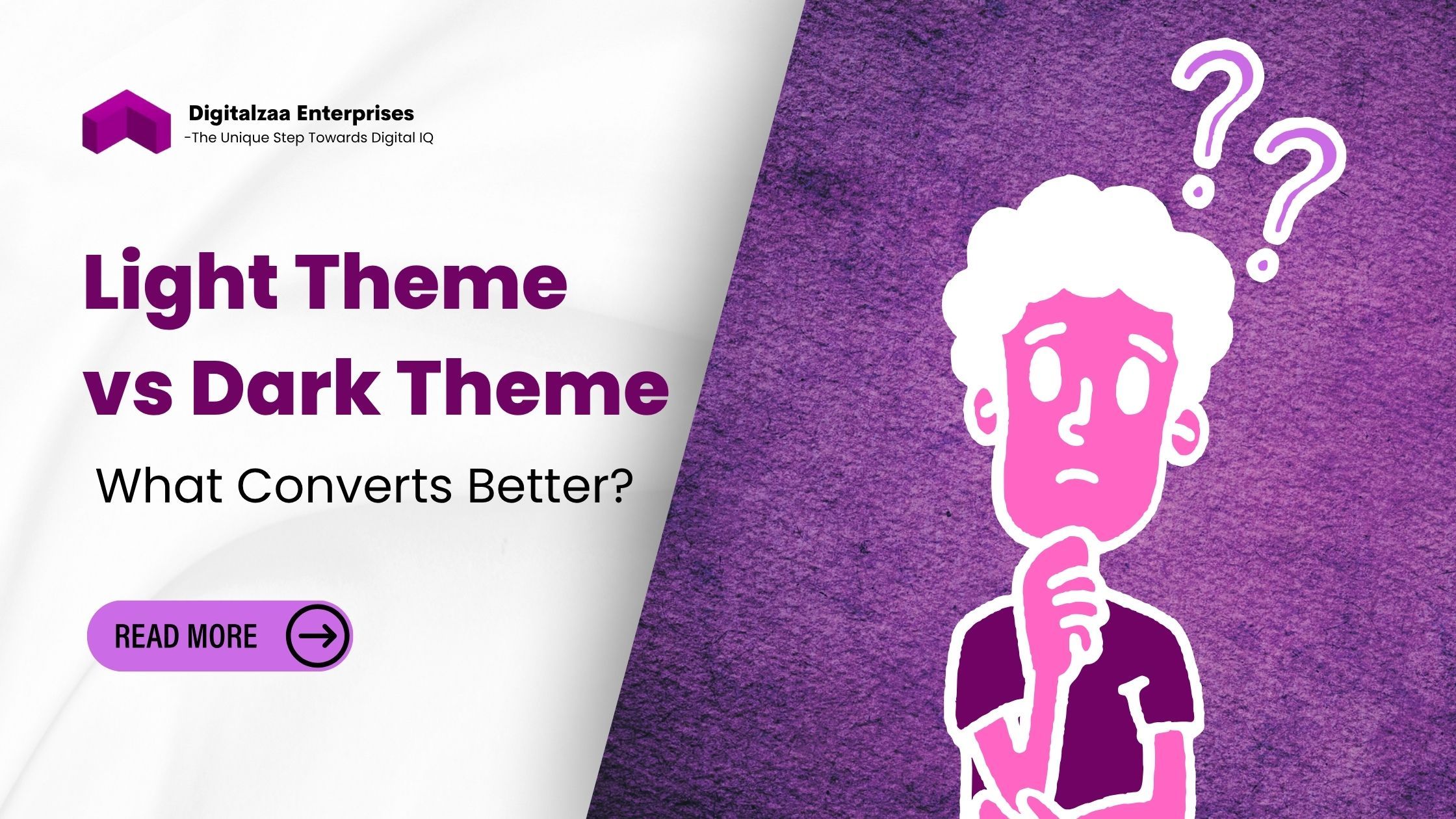
Light Theme vs Dark Theme: What Converts Better?
In the ever-evolving digital landscape, design plays a pivotal role in how users interact with content. One of the hottest debates in the UI/UX world today is the battle of light theme vs dark theme. Businesses, designers, and developers constantly ask: Which theme converts better? Which drives more engagement, readability, and ultimately, results?
This blog dives deep into the psychology, performance, and user behavior surrounding both themes. Whether you're building a website, app, or selecting a theme template for your brand, understanding the impact of a light or dark interface is essential for optimizing conversion rates.
Understanding Light and Dark Theme Templates
Before diving into analytics and preferences, let's define our two main contenders:
- Light Template Theme: This is the more traditional theme style, featuring dark text on a light background. It's often associated with professionalism, cleanliness, and readability.
- Dark Template Theme: A modern twist that presents light text on a dark background. Dark themes are sleek, visually striking, and favored for their aesthetic appeal in tech-forward or creative industries.
While both have their aesthetic and functional purposes, conversion rates boil down to more than just style. They encompass user behavior, readability, emotional response, and accessibility.
The Psychology of Color and Contrast
Colors have a psychological impact on users. Light themes, with white or pale backgrounds, create a sense of space, calmness, and clarity. They are especially effective in settings where content consumption is high, like blogs, news sites, or e-commerce platforms.
Dark themes, on the other hand, offer a luxurious, bold feel. They are perceived as innovative and elegant. This is why many tech startups, gaming platforms, and design portfolios prefer a dark interface.
Contrast is also crucial. Poor contrast in either theme can deter users. For example, low contrast in a dark theme can strain the eyes, while excessive brightness in a light theme can be equally unpleasant, especially in low-light environments.
User Preferences: What Do Studies Show?
Recent surveys and A/B testing data show interesting insights:
- Around 81% of people use dark mode on their phones, according to a 2023 Android Police survey.
- Light theme still dominates in desktop and web environments, especially among older audiences and professional users.
- Younger users (under 35) tend to prefer dark modes, particularly for apps and entertainment-based platforms.
- E-commerce studies show a slight preference for light themes, especially when showcasing product images.
These preferences matter because knowing your audience is key to deciding on your template. An entertainment app may benefit more from a dark template theme, while a business blog or online store might convert better using a Light template theme.
Accessibility and Readability
Accessibility is a key factor influencing theme design. Light themes usually provide better readability for large blocks of text. This is why most text-heavy platforms still default to a light theme.
However, dark themes have made strides in accessibility by using proper contrast ratios and accessible color palettes. For instance, using off-white or muted colors on a charcoal background reduces eye strain and maintains readability.
Designers must also consider color blindness and other visual impairments. Accessible design isn’t about choosing one over the other; it's about how well your chosen theme template accommodates diverse needs.
Conversion Metrics: What Really Works?
Let’s break down the conversion implications:
- Time on Site
- Users tend to spend more time on sites where the theme aligns with their expectations and environment.
- Blogs and educational platforms using a light template theme report longer average session times.
- Click-Through Rates (CTR)
- CTAs (Call-To-Actions) often stand out more in light themes because of the contrast.
- However, dark themes can deliver impressive CTRs if the CTAs are brightly colored and well-positioned.
- Bounce Rate
- Regardless of whether it is dark or light, a poorly designed theme raises bounce rates.
- Responsive, well-designed templates perform better across both spectrums.
- Sales and Conversions
- E-commerce stores often experience better sales with light theme templates, as they present product images more clearly.
- Niche sites like portfolios, apps, and gaming products may see higher conversions with dark theme templates, due to better emotional and aesthetic engagement.
When to Use a Light Template Theme
- Text-Heavy Websites: Blogs, news, and content platforms.
- E-commerce: To present products clearly and reduce visual fatigue.
- Professional Services: Clean, corporate sites where clarity is key.
- Day-Time Users: Audiences primarily using your site during work hours.
Pros:
- Easy to read
- Familiar to most users
- Professional and trustworthy vibe
Cons:
- It can be harsh on the eyes in low-light conditions
- Less visually striking
When to Use a Dark Template Theme
- Creative Portfolios: Artists, designers, and photographers.
- Tech Products: SaaS tools, startups, and developer platforms.
- Entertainment Platforms: Gaming, streaming, or music apps.
- Night-Time Users: Apps or platforms used in darker environments.
Pros:
- Visually engaging
- Reduces eye strain in dark settings
- Highlights media and visuals effectively
Cons:
- Can reduce readability if not designed properly
- May alienate users who prefer traditional layouts
Theme Template Optimization Tips
Whether you go light or dark, your theme template needs to be optimized for conversion:
- Ensure a strong contrast for text and CTAs
- Use consistent typography and spacing
- Test your design under various lighting conditions and on a variety of devices.
- Provide users with the option to switch between themes, especially in apps
- A/B test different versions to find what converts best for your audience
Light vs Dark Theme: Final Verdict
There’s no one-size-fits-all answer in the light vs dark theme debate. Your audience, content, and platform all influence what converts better.
- For business websites, blogs, and online stores, the light template theme is a safe bet with broader appeal and proven performance.
- For tech products, creative industries, and mobile-first apps, a dark template theme can enhance user engagement and elevate brand perception.
Ultimately, the best approach is user-centric. Use analytics, test different options, and let your audience's behavior guide your design choices.
Conclusion
In the clash of light theme vs dark theme, both have their merits and potential pitfalls. Selecting the right theme template for your digital presence should be a balance of visual appeal, functionality, and user preference.
Don’t follow trends blindly, analyze your audience, test your designs, and focus on providing a seamless, visually pleasing, and conversion-optimized experience. Whether you go for a light template theme or a dark template theme, the right design can make all the difference.
Ready to revolutionize your agency's brand image and save countless design hours? CLICK HERE to get instant access to our complete Social Media Marketing Agency Premium Templates collection!
Author

Disha Rathi
International Author & Founder
Disha Rathi, is the Founder of Digitalzaa Enterprises, Quest Internationals, Marketing Enigma Business Magazine, CEO at Reliserv Solution & International Author. Disha Got Awarded BEST EMERGING WOMAN ENTREPRENEUR of the Year 2022. Disha helps individuals & Businesses to scale their revenue using Online Marketing by adding professional Skills in their mindset to get more Clients/customers. She had mentored multiple Businesses to hit 6-7 figures in revenue using her Brilliant Techniques & her 10+ Years of experience in the Field of Marketing.

