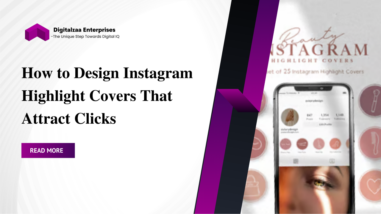
How to Design Instagram Highlight Covers That Attract Clicks
Instagram is more than just a place to post selfies and aesthetic photos it has evolved into a powerful platform for personal brands, entrepreneurs, and businesses to showcase their identity. One of the most underrated yet effective branding tools on Instagram is Instagram Highlight Covers.
Think of them as your profile’s “front shelves.” They’re the first thing people see when they land on your page, sitting neatly under your bio. When designed right, these covers not only improve your visual branding but also attract clicks, increase story views, and guide followers to important content.
In this guide, we’ll break down exactly how you can create engaging and professional Instagram Highlight Covers, avoid common mistakes, and design covers that truly make people want to explore your content.
Why Instagram Highlight Covers Matter
When someone lands on your Instagram profile, they make a snap judgment about whether to follow you. In fact, research shows people decide within seconds if they’ll engage with your profile. That’s why design consistency and aesthetics matter.
Here’s why Instagram Highlight design plays such an important role:
- First impressions count: A neat row of well-designed highlight covers instantly makes your profile look professional.
- Easy navigation: They work like a website menu—helping users quickly find what they want (testimonials, products, services, FAQs, etc.)
- Brand recognition: Using consistent colors, fonts, and Instagram story highlight icons builds a strong brand identity.
- Increased engagement: Attractive covers spark curiosity, making people click and view your highlights.
In short: Highlight covers don’t just decorate your profile they guide followers to your most valuable content.
Step-by-Step Guide to Designing Instagram Highlight Covers

Designing your highlight covers can be fun and creative. You don’t need to be a professional designer; with tools like Canva, Adobe Express, or even built-in apps, you can create scroll-stopping covers in minutes.
Here’s how:
1. Define Your Brand Style
Before you dive into design, pause and define your brand’s identity.
- Colors: Choose your brand palette whether it’s minimalist neutrals, bold brights, or pastel shades.
- Fonts: If you plan to use text-based covers, stick to fonts that represent your brand style.
- Mood/Theme: Decide if your covers should be playful, elegant, modern, or luxurious.
Example: A fitness coach might use bold, energetic colors like red and black, while a lifestyle blogger may prefer soft beige and pastel pink.
2. Plan Your Highlight Categories
Your highlight covers are useless without categories that matter. Think about the main topics your audience wants to see.
Popular highlight categories include:
- About Me / Welcome: Introduce yourself or your brand.
- Products / Services: Showcase your offerings.
- Tutorials / How-To: Step-by-step guides.
- Testimonials: Customer feedback.
- Behind the Scenes: Show your brand personality.
- Events / Launches: Promote past or upcoming events.
- FAQs: Answer common questions.
Tip: Don’t overwhelm visitors with too many highlights. Stick to 6–8 key categories.
3. Choose Icons or Graphics
Icons are the heart of Instagram story highlight icons. They should be simple, clear, and recognizable.
Here are some examples:
- Shopping bag 🛍️ → Products
- Camera 📷 → Behind the scenes
- Sparkle ✨ → Announcements
- Heart ❤️ → Customer love
- Book 📖 → Guides & tutorials
Use icons instead of text since highlight covers appear small, text may be hard to read.
4. Design in a Tool (Canva is Best for Beginners)
Canva is one of the easiest tools to create Instagram Highlight Covers.
Steps to design in Canva:
- Search “Instagram Highlight Cover” template.
- Choose a layout that matches your brand aesthetic.
- Customize background colors and icons.
- Keep it clean and minimal avoid overloading with details.
- Download in PNG or JPG format at high resolution.
Other tools you can try:
- Adobe Express (free, professional-looking templates).
- Photoshop/Illustrator (if you want advanced customization).
- Flaticon or Freepik (for free icons).
5. Upload Covers to Instagram
Once your designs are ready, add them to your profile:
- Open your Instagram profile.
- Select a highlight you want to edit.
- Tap “Edit Highlight.”
- Choose “Edit Cover” and upload your custom design.
- Repeat for each category.
Pro Tip: Arrange your highlights in the order of importance—put the most valuable ones first.
Tips to Make Your Covers Click-Worthy

Not all highlight covers attract clicks. If you want yours to stand out, follow these tips:
- Keep it simple: Avoid too much detail. Minimal icons work best.
- Use contrast: Bold icons on soft backgrounds catch the eye.
- Match your feed aesthetic: Covers should flow naturally with your grid style.
- Stay consistent: Use the same icon style and color scheme across all covers.
- Update regularly: Refresh your highlight covers every few months or during seasonal campaigns.
Creative Ideas for Highlight Covers
Want to add a unique twist to your Instagram Highlight design? Try these creative ideas:
- Minimalist Line Icons: Simple line drawings give a modern, clean look.
- Photo Covers: Instead of icons, use close-up images for a personal touch.
- Seasonal Updates: Change covers for holidays, sales, or new launches.
- Luxury Aesthetic: Use marble textures, gold accents, or muted tones for premium vibes.
- Animated Covers: Trendy GIF-style icons for a dynamic effect.
Creativity is key don’t be afraid to experiment until you find a style that represents your brand.
Common Mistakes to Avoid
While designing Instagram Highlight Covers, avoid these common pitfalls:
- Mixing too many design styles (inconsistent look).
- Using tiny text that’s unreadable in small circles.
- Choosing clashing or oversaturated colors.
- Ignoring mobile-first design (remember: most users view highlights on phones).
- Adding too many categories, which overwhelms visitors.
SEO Benefits of Highlight Covers
You might wonder what do Instagram Highlight Covers have to do with SEO?
While Instagram itself isn’t search-engine-based like Google, the design and presentation directly affect engagement, which indirectly boosts visibility.
Here’s how:
- Higher engagement: Attractive covers = more clicks and story views.
- Better brand trust: A professional look encourages users to follow.
- Increased conversions: Highlights can direct followers to products, services, or websites.
In short: Good design improves clicks, clicks improve engagement, and engagement helps your content perform better.
Conclusion
In today’s competitive Instagram landscape, aesthetics and strategy go hand in hand. Instagram Highlight Covers may seem like a small detail, but they play a huge role in shaping first impressions, guiding profile visitors, and boosting engagement. By focusing on clean Instagram Highlight design and using clear Instagram story highlight icons, you make it easier for followers to navigate your content while also reinforcing your brand identity.
Remember, consistency and simplicity are key. Treat your highlight covers as part of your brand storytelling—keep them aligned with your color palette, refresh them for seasonal campaigns, and use them strategically to drive clicks toward your most valuable content. When designed thoughtfully, your covers won’t just beautify your profile they’ll help turn casual scrollers into loyal followers and paying customers.
Author

Disha Rathi
International Author & Founder
Disha Rathi, is the Founder of Digitalzaa Enterprises, Quest Internationals, Marketing Enigma Business Magazine, CEO at Reliserv Solution & International Author. Disha Got Awarded BEST EMERGING WOMAN ENTREPRENEUR of the Year 2022. Disha helps individuals & Businesses to scale their revenue using Online Marketing by adding professional Skills in their mindset to get more Clients/customers. She had mentored multiple Businesses to hit 6-7 figures in revenue using her Brilliant Techniques & her 10+ Years of experience in the Field of Marketing.

