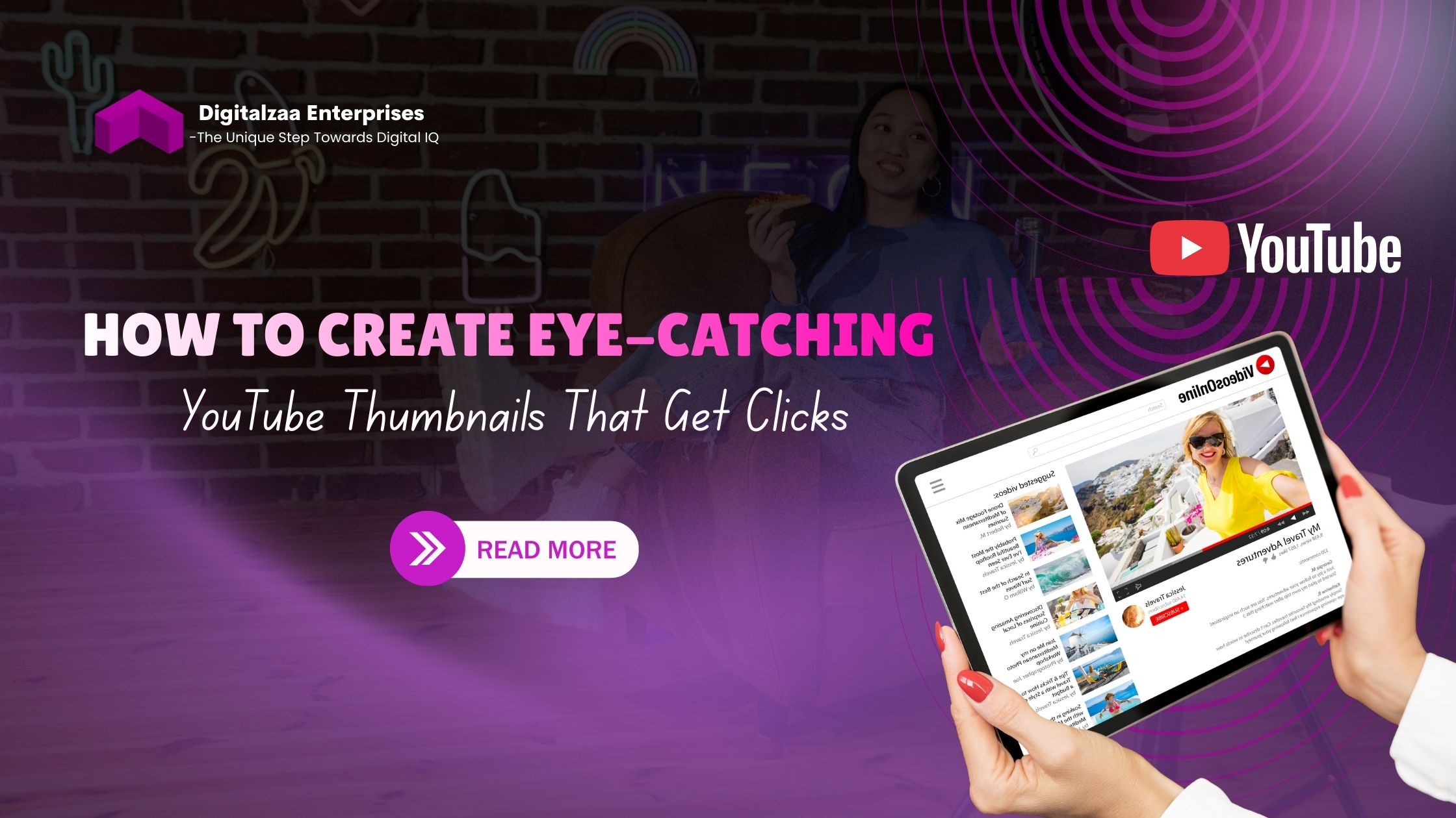
How to Create Eye-Catching YouTube Thumbnails That Get Clicks
In the crowded world of YouTube, your thumbnail is your first impression and often the deciding factor between a viewer clicking on your video or scrolling past it. Mastering YouTube thumbnail design isn't just about making pretty pictures it's about psychology, branding, and strategic visual communication that drives engagement.
Why YouTube Thumbnails Matter More Than You Think
Before diving into the how-to, let's understand the stakes. YouTube reports that 90% of the best-performing videos have custom thumbnails. Your thumbnail works alongside your title to communicate value, spark curiosity, and convince viewers that your content is worth their time. In a platform where millions of videos compete for attention, an optimized thumbnail can be the difference between viral success and complete obscurity.
Essential YouTube Thumbnail Tips for Maximum Impact
1. Embrace Bold, Contrasting Colors
High-contrast color schemes grab attention instantly: Your thumbnail needs to stand out in a sea of content. Use complementary colors that pop against YouTube's white or dark interface. Bright yellows, vibrant reds, electric blues, and bold oranges perform exceptionally well. Avoid muddy or muted tones that blend into the background.
Consider color psychology: Different colors evoke different emotions. Red creates urgency, blue builds trust, yellow sparks optimism, and green suggests growth or wealth. Choose colors that align with your video's message and your brand identity.
2. Use Readable, Large Text
Keep text minimal and impactful: Your thumbnail text should reinforce your title, not repeat it. Use 3-5 words maximum that highlight the key benefit or create intrigue. Think "SECRET REVEALED" or "This Changed Everything" rather than lengthy sentences.
Choose fonts that command attention: Bold, thick fonts like Impact, Bebas Neue, or Montserrat work best. Ensure text is readable even on mobile devices where thumbnails appear much smaller. Add contrasting outlines or shadows to make text stand out against any background.
3. Feature Expressive Human Faces
Emotions drive clicks: Human psychology naturally draws us to faces, especially those displaying strong emotions. Surprised expressions, excited smiles, or shocked reactions trigger curiosity and emotional connection. Ensure faces take up at least 30-40% of the thumbnail for maximum impact.
Eye contact creates connection: Position faces looking directly at the camera to establish immediate engagement with viewers. This direct gaze creates a psychological pull that's hard to resist.
Clickable Thumbnail Ideas That Convert Viewers
The Before-and-After Formula
Show transformation visually: Split your thumbnail into two halves, showing the starting point and the result. This works brilliantly for tutorials, makeovers, fitness content, or any transformation-based videos. The visual contrast immediately communicates value.
The Mystery Gap Technique
Create curiosity without revealing everything: Show just enough to intrigue viewers but hold back the payoff. Use arrows pointing to blurred objects, question marks, or partially visible elements that demand explanation. This psychological gap between what viewers know and want to know drives clicks.
The Pattern Interrupt Method
Break visual expectations: Use unexpected imagery, unusual angles, or surprising juxtapositions that make viewers pause mid-scroll. If all thumbnails in your niche use similar layouts, deliberately do something different to stand out.
The Number Strategy
Leverage the power of specificity: Thumbnails featuring numbers ("7 Secrets," "3 Mistakes," "$10,000 Result") perform exceptionally well because they promise specific, digestible value. Numbers add credibility and set clear expectations.
Advanced YouTube Thumbnail Design Strategies
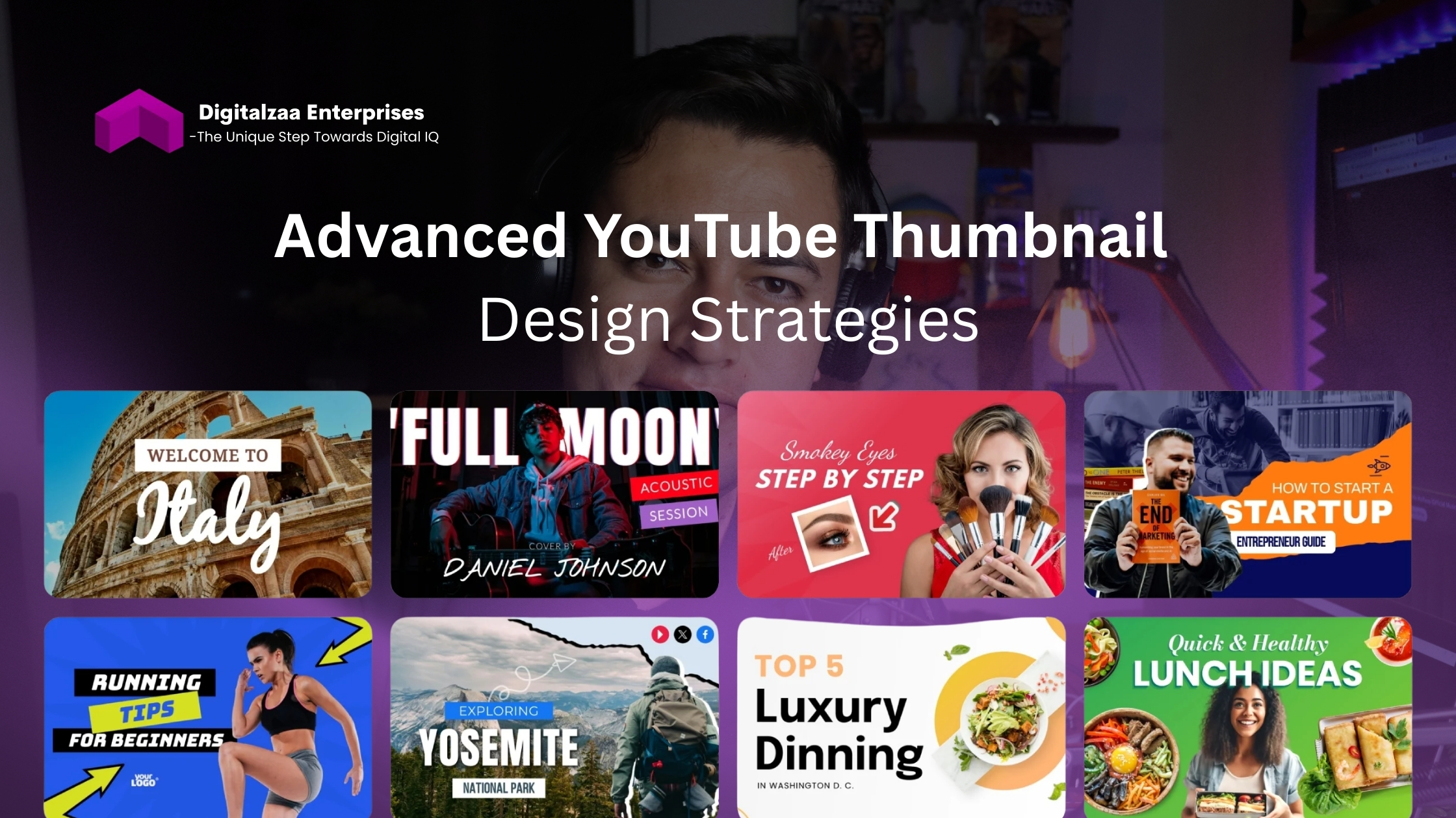
Maintain Consistent Branding
Create a recognizable visual signature: Use consistent color schemes, fonts, or layout patterns across your thumbnails. This builds brand recognition and helps your content stand out to returning viewers. Consider adding a small logo or branded element in the same position on every thumbnail.
Optimize for Mobile Viewing
Test at small sizes: Over 70% of YouTube watch time happens on mobile devices. Design your thumbnail at full size, then preview it at mobile dimensions. If elements become unclear or text becomes illegible, simplify your design.
Use High-Quality Images
Never compromise on resolution: Always use images with at least 1280x720 pixels resolution. Blurry, pixelated, or low-quality visuals instantly destroy credibility and professionalism, no matter how clever your design might be.
Add Strategic Visual Cues
Guide the viewer's eye: Use arrows, circles, or highlighting to direct attention to key elements. These visual cues create a viewing path and emphasize important information without requiring additional text.
Common YouTube Thumbnail Mistakes to Avoid
- Overcrowding your design: Too many elements create visual chaos. Follow the principle of simplicity each thumbnail should communicate one clear message.
- Using clickbait without delivering: While eye-catching thumbnails are essential, misleading viewers destroys trust and hurts your long-term channel growth through increased bounce rates.
- Ignoring YouTube's safe zones: Timestamps appear in the bottom-right corner of thumbnails. Keep important elements away from this area to prevent critical information from being covered.
- Copying competitors exactly: While analyzing successful thumbnails in your niche provides valuable insights, direct copying makes you forgettable. Find your unique visual voice.
Tools to Elevate Your Thumbnail Game
Several platforms make professional YouTube thumbnail design accessible even without advanced graphic design skills. Canva offers YouTube-specific templates with drag-and-drop functionality. Adobe Express provides powerful editing capabilities with AI-assisted features. Photoshop remains the gold standard for complete creative control, while tools like Snappa and Crello offer quick, template-based solutions.
Testing and Improving Your Thumbnails

- A/B test different approaches: YouTube allows you to change thumbnails after publishing. Monitor your click-through rate (CTR) in YouTube Analytics and experiment with variations to discover what resonates with your specific audience.
- Analyze your best performers: Identify which thumbnails generated the highest CTR and reverse-engineer their success. Look for patterns in color choices, text usage, facial expressions, and composition.
Conclusion
Creating compelling YouTube thumbnails combines art, psychology, and data-driven strategy. By implementing these YouTube thumbnail tips and experimenting with various clickable thumbnail ideas, you'll develop an intuitive understanding of what captures your audience's attention. Remember that effective thumbnail design evolves with your channel what works today might need refinement tomorrow. Stay curious, keep testing, and let your analytics guide your creative decisions. Your thumbnail is your video's billboard in the busiest marketplace on the internet make every pixel count.
Author

Disha Rathi
International Author & Founder
Disha Rathi, is the Founder of Digitalzaa Enterprises, Quest Internationals, Marketing Enigma Business Magazine, CEO at Reliserv Solution & International Author. Disha Got Awarded BEST EMERGING WOMAN ENTREPRENEUR of the Year 2022. Disha helps individuals & Businesses to scale their revenue using Online Marketing by adding professional Skills in their mindset to get more Clients/customers. She had mentored multiple Businesses to hit 6-7 figures in revenue using her Brilliant Techniques & her 10+ Years of experience in the Field of Marketing.

