Best Fonts for a Premium Social Feed: Elegant & Luxury Style Fonts.
In the competitive landscape of social media, the visual aesthetics of your content can make or break your online presence. Among the many design elements that contribute to a polished feed, fonts for social media play a pivotal role in establishing your brand's identity and elevating your content. This comprehensive guide explores the best fonts for Instagram and other platforms that will transform your ordinary posts into sophisticated visual statements.
Why Typography Matters for Your Premium Social Media Presence
Before diving into specific fonts for premium feed options, it's essential to understand why typography deserves your attention. Typography isn't merely about readability; it's a powerful design element that:
- Conveys your brand's personality and values
- Directs the viewer's attention and establishes a visual hierarchy.
- Establishes consistency across your social media presence
- Differentiates your content from competitors
- Evokes specific emotions and associations
When curating a luxury or premium aesthetic, your font choices should reflect sophistication, exclusivity, and timeless elegance. The right typography can instantly communicate premium quality without saying a word.
The Psychology Behind Premium Typography
Luxury brands are aware that specific typographic traits convey exclusivity and grandeur. These include:
- Appropriate spacing: Generous letter spacing (kerning) often creates an air of sophistication
- Weight balance: A thoughtful combination of thick and thin strokes suggests refinement
- Consistent styling: Clean, cohesive font pairings that don't clash
- Restrained use: Premium typography often follows the "less is more" principle
With these principles in mind, let's explore the most elegant and luxurious fonts for Instagram posts and other social platforms.
Serif Fonts: Timeless Elegance for Your Social Feed
Serif fonts, characterized by their small lines or "feet" at the ends of characters, have long been associated with tradition, reliability, and sophistication. Here are some standout serif options for your premium social media presence:
- Didot: Didot is the quintessential luxury font, featured in logos and headlines of high-fashion magazines like Vogue and Harper's Bazaar. Its dramatic contrast between thick and thin strokes creates a striking visual impact that screams sophistication.
Best used for: Headlines, quotes, and feature text in posts where you want to make a bold, luxurious statement.
- Baskerville: More subtle than Didot but equally refined, Baskerville strikes the perfect balance between readability and elegance. Its slightly rounded serifs and moderate contrast make it versatile for both longer captions and striking headlines.
Best used for: Longer text passages where readability matters, but you don't want to sacrifice sophistication.
- Playfair Display: This font beautifully bridges classical typography and modern design sensibilities. With its distinctive character shapes and dramatic thick-thin transitions, Playfair Display commands attention while maintaining an air of timeless elegance.
Best used for: Eye-catching quotes, carousel cover slides, and powerful statement text.
- Cormorant Garamond: With its thin strokes and graceful proportions, Cormorant, a contemporary take on the traditional Garamond design, exudes a delicate and sophisticated presence. Its lightweight gives it an airy, exclusive feel, perfect for luxury content.
Best used for: Minimal, clean designs where typography takes center stage.

Sans-Serif Fonts: Modern Luxury for Contemporary Brands
While serif fonts often connote traditional luxury, sans-serif fonts (those without the small projecting features) can equally convey premium quality with a more contemporary edge.
- Montserrat: With its geometric precision and balanced proportions, Montserrat offers a clean, sophisticated look that works beautifully across various social media font applications. Its diverse weight options make it incredibly versatile.
Best used for: Brand consistency across different post types, from captions to overlaid text.
- Optima: Optima has a distinct character due to its subtle flared ends, even though it is formally categorised as sans-serif. This hybrid nature makes it an exceptional choice for brands wanting to bridge classic and contemporary luxury.
Best used for: Brands that balance traditional values with modern sensibilities.
- Futura: With its perfect geometric forms based on circles and straight lines, Futura embodies modernist elegance. Used by brands like Louis Vuitton and Calvin Klein, it communicates precision, exclusivity, and forward-thinking design.
Best used for: Clean, minimalist aesthetics where geometric precision enhances your message.
- Proxima Nova: Proxima Nova, which is sometimes referred to as the ideal fusion of geometric and grotesque sans-serifs, provides outstanding readability along with a dash of unique personality. Its versatility makes it ideal for creating cohesive premium feeds.
Best used for: Body text in carousel posts, captions that need to be highly readable, and consistent branding elements.
Script Fonts: Adding a Personalized Touch of Luxury
For brands wanting to incorporate a sense of handcrafted exclusivity or personal connection, premium script fonts can add the perfect flourish to your fonts for Instagram posts.
- Quickpen: This elegant script mimics refined handwriting with its flowing connections and balanced character height. Unlike many overly decorative scripts, Quickpen maintains readability while adding a touch of personal flair.
Best used for: Signatures, short quotes, or emphasis words within predominantly sans-serif or serif designs.
- Copperplate: Though not a traditional script, Copperplate's engraving-inspired design evokes luxury invitation cards and high-end stationery. Its all-caps style conveys a strong message without compromising style.
Best used for: Brand names, important announcements, or any text that deserves special emphasis.
- Snell Roundhand: This classic script font strikes the perfect balance between formality and flowing elegance. Its varying stroke thickness and controlled connections make it more readable than many script alternatives.
Best used for: Adding a personal, handcrafted touch to otherwise minimal designs.
Creating Perfect Font Pairings for Premium Social Media Content
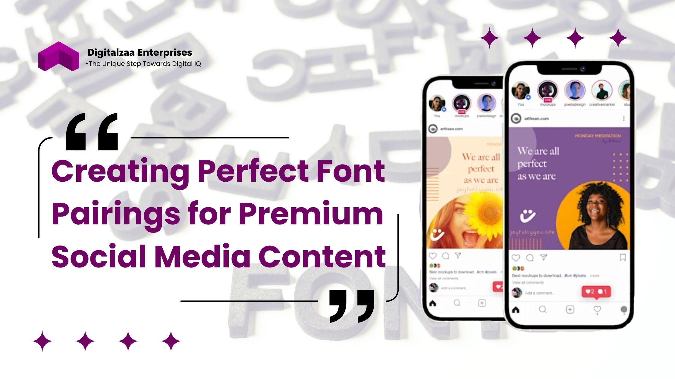
One of the hallmarks of sophisticated design is thoughtful font pairing. For a truly premium look, consider these proven combinations:
- The Classic Luxury Pairing
- Headlines: Didot (serif)
- Body text: Montserrat (sans-serif)
- The Modern Minimal Luxury Pairing
- Headlines: Futura (sans-serif)
- Body text: Baskerville (serif)
- The Sophisticated Contrast Pairing
- Headlines: Playfair Display (serif)
- Body text: Proxima Nova (sans-serif)
Technical Considerations for Using Premium Fonts in Social Media
While aesthetics are paramount, there are practical considerations when implementing fonts for social media:
- Platform Limitations
Instagram and many other platforms don't allow custom font embedding directly in posts. To overcome this:
- Create pre-designed templates with your chosen fonts in design tools like Canva or Adobe Express
- Use apps like "Fonts for Instagram" or "Font Candy" for bio and caption special characters
- Save important text as images while ensuring they remain accessible
- Readability Across Devices
Premium doesn't mean impractical. Ensure your chosen Fonts for Social Media remain readable:
- Test your designs on multiple devices before posting
- Maintain adequate contrast between text and background
- Consider slightly increasing letter spacing for script fonts
- Avoid using more than 2-3 font families across your feed
- Consistency for Brand Recognition
For a truly premium feed, consistency is crucial:
- Create a typography style guide with specific fonts for different content types
- Define exact sizes, weights, and spacing for each application
- Stick to your chosen fonts across all platforms for stronger brand recognition
Trending Font Styles for Premium Social Media in 2025
As we move deeper into 2025, certain typography trends are defining luxury in the social media space:
- Refined Minimalism: Ultra-clean sans-serifs with subtle, unique characteristics are dominating premium feeds. Fonts like Neue Haas Grotesk and GT America provide the perfect foundation for minimalist luxury.
- Neo-Classic Revival: Updated interpretations of classical typefaces are seeing a resurgence. Fonts that combine traditional luxury with modern sensibility are Argent CF and Eksell Display.
- Controlled Expressiveness: Premium brands are embracing fonts with personality, but in a controlled, intentional manner. Typefaces like Canela and Leitura offer distinctive character without sacrificing sophistication.
Fonts to Avoid for Premium Social Media Presence
Just as important as knowing which fonts elevate your content is understanding which ones detract from a luxury aesthetic:
- Comic Sans and Papyrus: These fonts have become synonymous with amateur design
- Overused free fonts: Fonts like Lobster have been used so extensively that they've lost their distinctive appeal
- Overly decorative scripts: Fonts with excessive flourishes often sacrifice readability for style
- Trendy display fonts: Anything too closely tied to a specific period can quickly date your brand
Conclusion
The Best Fonts for Social Media and other social platforms are those that align with your brand values while conveying quality and sophistication. Whether you opt for the classical elegance of serifs like Didot, the modern precision of sans-serifs like Futura, or thoughtful combinations of multiple styles, your typography choices communicate volumes about your brand's positioning.
Remember that premium doesn't always mean complex; often, the most sophisticated feeds employ restrained, thoughtful typography that lets the content shine. By selecting appropriate fonts for premium feed creation and applying them consistently, you'll create a cohesive visual identity that stands out in today's crowded social media landscape. Investing time in developing your typography strategy isn't merely about aesthetics; it's about creating a distinctive visual voice that elevates your content from ordinary to extraordinary, capturing attention and conveying quality in every post.
Ready to revolutionize your agency's brand image and save countless design hours? CLICK HERE to get instant access to our complete Social Media Marketing Agency Premium Templates collection!
Author

Disha Rathi
International Author & Founder
Disha Rathi, is the Founder of Digitalzaa Enterprises, Quest Internationals, Marketing Enigma Business Magazine, CEO at Reliserv Solution & International Author. Disha Got Awarded BEST EMERGING WOMAN ENTREPRENEUR of the Year 2022. Disha helps individuals & Businesses to scale their revenue using Online Marketing by adding professional Skills in their mindset to get more Clients/customers. She had mentored multiple Businesses to hit 6-7 figures in revenue using her Brilliant Techniques & her 10+ Years of experience in the Field of Marketing.

