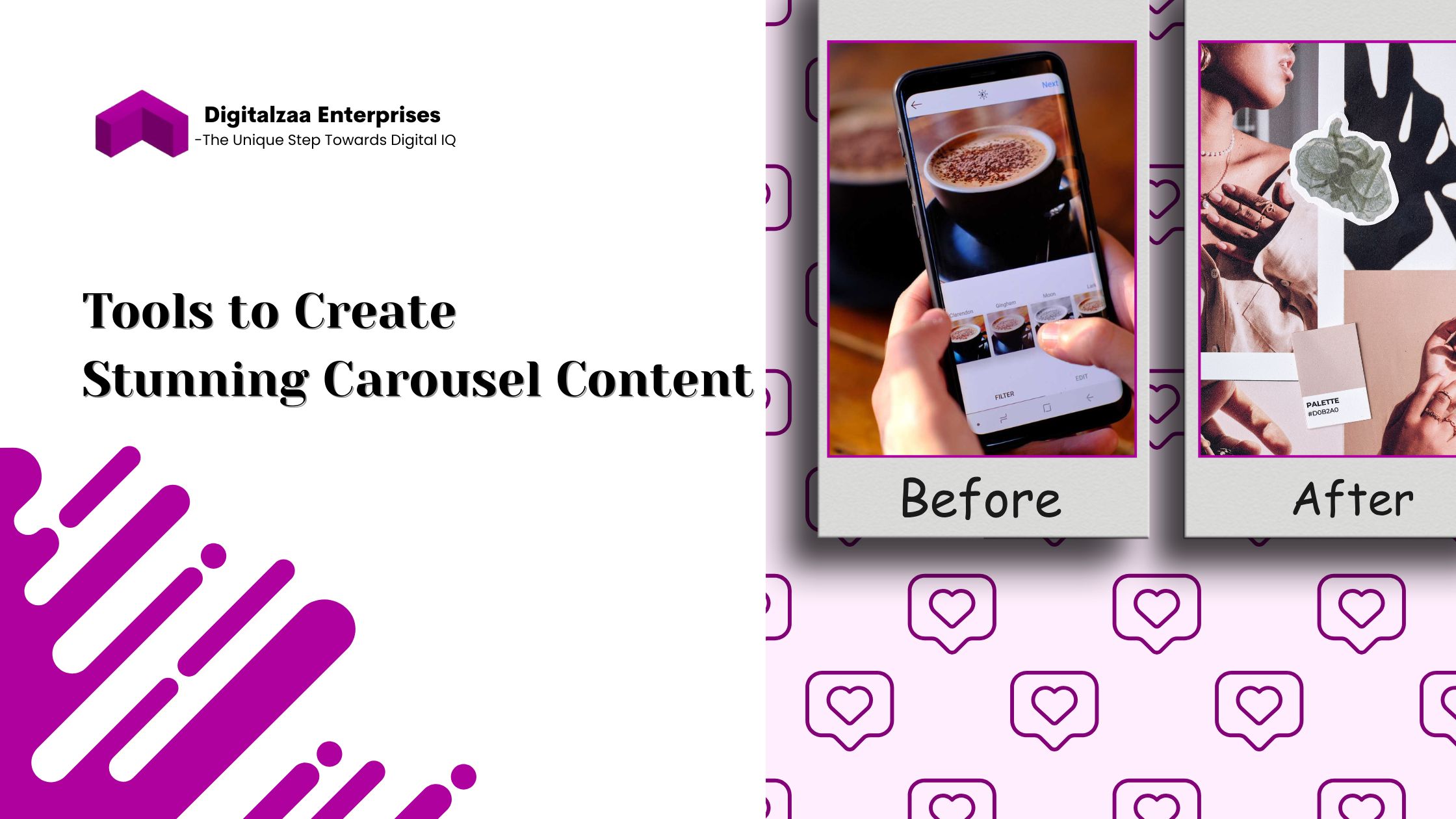
Before & After Instagram Post Examples: Swipe Carousel Inspiration for Better Engagement.

In the fast-scrolling, attention-starved world of Instagram, design isn’t just decoration, it’s persuasion. What makes someone pause and swipe in a feed filled with noise? The answer lies in smart, scroll-stopping visual storytelling. One of the most effective (and underused) ways to accomplish that? Before & After carousel posts.
These transformational visuals tap into the psychology of contrast, showing what was versus what is. Whether you’re demonstrating a product makeover, client success story, content redesign, or rebrand, the format naturally sparks curiosity. Viewers are compelled to swipe to see the difference.
But not all Before & After posts are equal. If you're only placing two images side by side, without context, strategy, or branding, you’re missing the true power of this content format.
In this blog, you’ll find:
- The psychology behind why Before & After posts perform
- Real, strategic Instagram post examples
- What makes a Before & After post effective
- Design tools and templates to help you create your own
- Bonus tips to improve engagement and saves
Why Do Before & After Posts Work So Well on Instagram?
The human brain is hardwired to spot differences. It’s part of our survival instincts,our brains are trained to detect change quickly. On Instagram, this plays out perfectly in the swipe carousel format.
A well-designed Before & After post leverages:
- Contrast: Differences make things more noticeable
- Curiosity: People want to “complete the loop” by seeing what changed
- Visual proof: Claims feel more trustworthy when backed by transformation
- Narrative: The Before & After format tells a mini success story in just a few slides
When users see a post that says “Before…” they immediately wonder: What comes next? That’s a powerful psychological trigger to keep them engaged, swiping, and interacting with your post.
Real Instagram Carousel Inspiration: Before & After Post Examples

Let’s look at two specific examples and break down what didn’t work and how the After version changed the game.
Example 1: Quote Graphic Post
❌ Before
- Plain black text on a white background
- No logo, no color scheme, no consistent typography
- No hook or clear call to action
Caption overlay: “No visual consistency. Low engagement.” This type of post may carry a good message, but it lacks brand identity and strategy. It’s generic. People scroll past it because it doesn’t catch the eye or feel unique.
✅ After
- Bold brand color background that matches the IG grid theme
- Stylized fonts with a strong quote hierarchy
- Small logo watermark + CTA: “💾 Save for daily inspo”
Caption overlay: “Branded design + CTA = higher saves & shares”
Why this works: Now the post belongs to the brand visually. The fonts guide the reader’s eye through the quote. The use of a CTA, “Save this quote”, gives users a reason to engage. It transforms a bland post into a high-performing content asset.
Example 2: Product Promotion Post
❌ Before
- Standard eCommerce-style product photo
- Awkward angle, poor lighting
- Caption: “Check out our new arrivals 👇”
Caption overlay: “No story. Just a product.” Even if the product is great, this presentation feels flat and uninspiring. No lifestyle, no story, and no emotional pull.
✅ After
- Lifestyle photo featuring the product in use
- Overlay copy: “Transform your space with this piece!”
- Harmonized color scheme that matches the brand palette
- Tagline + subtle CTA: “Link in bio to explore more”
Caption overlay: “Emotional connection = better conversions”
Why this works: It’s no longer just a product; it’s a solution. People can see how it fits into their lives. Lifestyle shots generate emotional resonance, and emotional resonance leads to action.
What Makes a Great Before & After Instagram Post?
Not every “Before” and “After” comparison will automatically perform well. Let’s explore the components of a truly effective Before & After carousel post:
- Strong Visual Consistency: Your “After” post should reflect your brand identity. This includes:
- Color palettes
- Typography
- Layout style
- Watermarks or logos
This consistency boosts recognition, helps build trust, and makes the transformation feel polished.
- Clear, Visible Transformation: Ensure that the contrast is immediately noticeable,even from a glance. This could be:
- A change in design
- A measurable result (follower growth, traffic boost)
- A new look or layout
If the change is subtle, emphasize it with directional graphics or comparison copy: “Before → After,” “Old vs New,” or “Then vs Now.”
- Storytelling Slide Structure: Great carousels are like mini-narratives. A proven formula:
- Hook Slide – Ask a question or show a dramatic “Before” teaser
- Slide 2-3 – Display the transformation
- Slide 4+ – Add proof or detail (testimonial, breakdown, results)
- Final Slide – Call to action (Read more, Save, Comment, DM, etc.)
- Text Overlay That Enhances Meaning: Don’t leave interpretation up to chance. Guide the viewer’s understanding with minimal but clear copy. Great overlay examples:
- “Here’s what wasn’t working…”
- “See how we redesigned this…”
- “Result: 3x more engagement in 2 weeks”
- A Call to Action (CTA): Without a CTA, your post ends as just “nice to look at.” With a CTA, it becomes actionable. Ideas include:
- “Save this for later”
- “Try this in your next design”
- “Read the full story on our blog”
- “DM us for a carousel audit”
Bonus Tips to Maximize Engagement on Carousel Posts
Want to level up your Before & After carousel even more? Try these pro strategies:
- Use Contrasting Colors on Slides: This visually signals the transition from “Before” to “After” and strengthens the storytelling arc.
- Add Data or Metrics: If you're showing growth, conversions, or improvements, back it up with real numbers:
- “Website visits before: 1,200 → After: 4,200”
- “Conversion rate improved from 2% to 6.5%”
- Feature Real Feedback or Reactions: Incorporate screenshots of testimonials, user comments, or DMs that reflect the impact of the transformation. This builds trust and adds social proof.
- Design for Saveability: People love content they can refer back to. Frame your carousels like guides or frameworks they’d want to save. Examples:
- “3 Steps We Took to Improve This Layout”
- “Design Do’s and Don’ts, Before vs After”
- “Caption Tweaks That Boosted Our Engagement by 300%”
Tools to Create Stunning Carousel Content
Don’t let a lack of design skills hold you back. Use these user-friendly tools to get started today:
- Canva – Drag-and-drop templates with brand kit support
- Adobe Express – Great for fast creative content with preset layouts
- Figma – Ideal for design teams and pros needing precise control
- Mojo / InVideo – For animated or video-style carousel posts
- Easil / VistaCreate – Alternatives to Canva with similar features
Pro tip: Start with a reusable template so you can streamline production and keep your branding consistent.
Conclusion: Design That Tells a Story
Before & After posts are more than trendy, they’re mini case studies in visual form. Done well, they:
- Capture attention
- Tell a clear, high-value story
- Reinforce your brand identity
- Encourage interaction, saves, and shares
Get ready to upgrade your content. Start experimenting with Before & After carousels this week. Show your audience that transformation isn’t just possible, it’s visually proven.
Found this useful? Share it with your content team, bookmark it for your next content planning session.
Author

Disha Rathi
International Author & Founder
Disha Rathi, is the Founder of Digitalzaa Enterprises, Quest Internationals, Marketing Enigma Business Magazine, CEO at Reliserv Solution & International Author. Disha Got Awarded BEST EMERGING WOMAN ENTREPRENEUR of the Year 2022. Disha helps individuals & Businesses to scale their revenue using Online Marketing by adding professional Skills in their mindset to get more Clients/customers. She had mentored multiple Businesses to hit 6-7 figures in revenue using her Brilliant Techniques & her 10+ Years of experience in the Field of Marketing.

